NGC 4755 : COLOUR-MAGNITUDE DIAGRAMS
For a more detailed discussion on this topic, I
recommended you read the specific Southern Astronomical Delights page
on Colour-Magnitude Diagrams and
Hertzsprung Russell (HR) Diagrams and Some Basic Premises About Open Star
Clusters.
General parameters for NGC 4755 and its component stars has now
been studied in some detail for at least sixty years or so, with
published colour and brightness data for NGC 4755 is now available
from more than twelve different sources. (2006) I have adopted some
of the results from the “General
Catalogue of Photometric Data”,
which can be easily obtained (via the Internet) from the Swiss
Institute of Astronomy at the University of Lausanne. Figure 2 shows
some eighty-six stars plotted, of which seventy-one are
“high
quality” points (first deemed
‘quality’
stars by Arp, H. & Sant, C.T., Astron.J., 63,
341 (1958)).
Similar photometric studies were later obtained by Hagen (1970),
Schild (1970) and Schild et al. (1976). However, the best
improved set of UBV data was obtained from Dach, J. & Kaiser, D.,
“UBV photometry of the southern
galactic cluster NGC 4755 — Kappa Crucis”, A.&A.Sup.Ser., 58, 411
(1984), who list some eighty-six “primary” photoelectric UBV
observations, and 553 UBV photographic magnitudes. Each reduces the
limiting magnitude from 13.4 mag. to 16.4, and some down to about
20.5 magnitude for selected areas of the cluster, I.e. As published
by R. Sagar and R. D. Cannon, (A&A.Sup.Ser., 111,
75-84 (1995)).
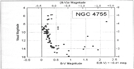
Figure 2 also directly shows the distribution of stars by
brightness and colour. The graph shows the plot of visual magnitude
versus the B-V magnitude — the essentials of the
Colour-Magnitude Diagram. B-V magnitudes are an indication of colour,
where values between -0.2 and +0.5 are blue to white stars, +0.5 to
+1.5 tend to be yellow stars, while those around +2.0 are generally
red. Each magnitude in Figure 2 was obtained by photometric means. I
have added for comparison on the right-hand side of Figure 2 the
absolute magnitude scale, which is particularly uncertain,
because it needs derived quantities like spectral data and evolution
theory. (Note: On this scale the Sun would be below the lowest part
on this graph.)
Figure 2. THE COLOUR-MAGNITUDE DIAGRAM of
the BRIGHTEST STARS in JEWEL BOX
The upper x-axis in any colour magnitude
diagrams shows the (B-V)0 magnitude. However an observer
must takes into account the amount of absorption of light, or
extinction, of the material or gas between us and the cluster.
You may notice that the (B-V)0 and B-V are slightly
different, well this difference is the actual magnitude extinction
taken into account. Absorbed light tends to make the observed
starlight reddish, where the (B-V)0 shifts to the right. I
have used the mean extinction magnitude of E(B-V) of 0.41, as given
by Sagar and Cannon (1995). The scale shifts to the right, suggesting
that the light has reddened.
Figure 2 also tells us much about the constitution of the cluster
members. Stars above 8th magnitude are the brightest members in the
‘A’-shaped asterism. The six stars at the very
top of the main sequence (the line of stars moving down the
left side of the graph) are the blue giant stars, and the single
massive red supergiant is B-V of +2.22.
Progressing down the CM Diagram finds fainter and fainter bluish
stars, and it is not until about 13th magnitude, do we start to see
many of the yellow to red stars. Brightest of the fainter group is
the so-called “NGC 4755
104” which is an orange 11.03 mag. star
at B-V of +1.57.
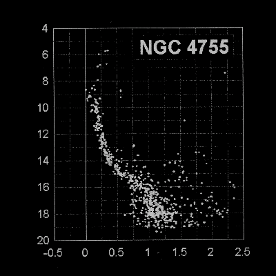
Figure 3. A DEEPER COLOUR-MAGNITUDE DIAGRAM for NGC
4755
Note that around 13th magnitude that the
stars curve more sharply inwards — marking the so-called
turn-off point. This place is of some astrophysical
importance, as it reveals quantifiable information about the age of
the cluster. Adapted from Sagar, R., Cannon, R.D.; A&A.Sup.Ser,
111, 75 (1995) (Ref. 26)
Stellar evolution theory tells us that stars lie on the main
sequence for 80% of their lives. It is only after the fuel shortages
take hold, within each stellar core, that each star moves away from
the main sequence. In every case, the biggest and most massive stars
are far more voracious with their fuel consumption. So the higher the
stellar mass, the higher the placement of the star on the main
sequence. Figures 2 and 3 clearly show this, with the largest stars
slightly right but off the main sequence. The largest star here has
to be the red giant farther to right, as it has already moved away
from its siblings and has enlarged to become a red giant. All the
stars above this turn-off point are either near or have moved
right off the main sequence. Those below the turn-off point
have yet to do so, and these simply continue to keep on slowly
burning hydrogen.
Amateur Uses of Colour-Magnitude Diagrams
Although these Colour-Magnitude Diagrams seem very technical,they
can be practicably used to estimate the appearance and magnitude
distribution of the cluster in the telescope. To do this, you will
need the edge of a piece of paper, or even better, a clear
transparent sheet of plastic.
1. Place the straight edge of the paper along the
line of the visual magnitude scale.
2. Next, draw down the
page’s
straight-edge to the 6th magnitude line. This reveals three stars,
which make up the points of the triangle of the
‘A’.
These are the most luminous stars.
3. Drop the line’s
edge to 8th magnitude. This shows the principal stars of the
‘A’,
showing seven of the blue stars and one solitary red one.
3. Further down, around 10th magnitude, the limit of
7×50 binoculars, reveals that you should probably see some
twenty-three stars, two of which are now yellowish in colour.
4. If we reduce this line down to 14th magnitude, we
are principally seeing the main bright stars of the cluster. (I
suggest you have a look at a colour photograph of the Jewel Box and
do a count of the stars to confirm this. A good one, for example,
appears in AOST2 as Plate 18.)
5. You will find that the blue stars counted from
Figure 3 are about the same on the AOST2 photograph, or the
grey-scale image attached. This also applies to the coloured
stars.
As you can see, this method tells us roughly how the cluster will
appear, both numerically and colour-wise. Furthermore, one can never
claim to have
“seen”
the Jewel Box, as different apertures show different types of stars
— so the overall impressions between individuals are fairly
subjective. Such methods also work brilliantly with C-M Diagrams of
Globular Clusters. It is interesting to find the magnitude of the
turn-off point. This can tell you where the fewer in number but more
massive main sequence stars end and majority of the lower
main-sequence ones start. At this place, the cluster may change in
appearance quite rapidly and it is interesting to apply this to the
magnitude limit of your telescope (if the limit of the telescope is
say 14th and the turn-off point is about the same). Try looking at a
few open clusters and their general appearance, then reduce the
aperture with cardboard field-stops. Compare the difference. What you
see might surprise you!
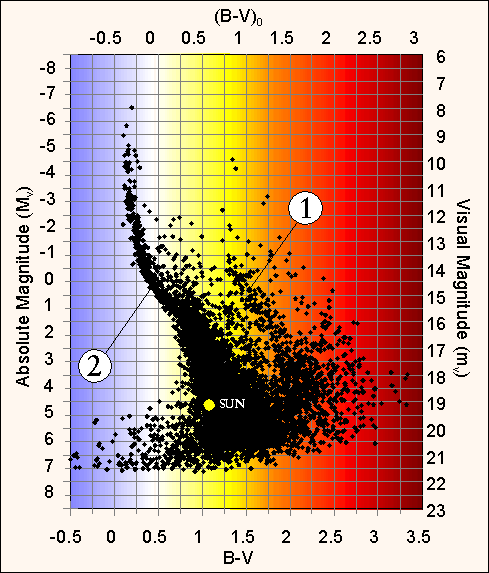
Most Recent Colour Magnitude Diagram
Figure 4. COLOUR-MAGNITUDE DIAGRAM of the JEWEL
BOX
Note that the stars are placed in not one but
two curves curves superimosed, suggesting the superposition of one
cluster over another or possibly two disinct bursts of star
formation. The first main-sequence is at “1”, the
other at “2”. The Sun is positioned doen the first main
sequence showing that many of the brighter components are more
luminous. [Adapted from Sanner, J., et al.; A&A,
369, 511 (2001)] (Ref. 27)
One of the lastest observations were gained by Koenig et al.
1998), in which a group of eight astronomers gathered CCD absolute
photometry of Kappa Crucis at La Silla in Chile using an 61cm f/15
Cassergrain. There paper (Koenig, Ingoet. et al.; AGM,
14, p.35 Jan (1998)) Showed stars down to 14.5V magnitude the
resultant colour-magnitude diagram found the main sequence turn-off
point at 8.0V magnitude. Furthermore twenty–six stars had their
MK spectral classification determined roughly that also produced the
mean absorption E(B–V) of 0.344±0.012 magnitude.
One interesting postulate is that Kappa Crucis may be two clusters
nearly superimposed on top of each other. (See Figure 3a) This would
explain the apparent disparity between the very bright stars against
the more numerous fainter ones. Another possibility is that this
could be an example of the merging of two open clusters, or even two
clusters forming in the same nebula, but during two separate bursts
of evolution, possibly some two million years apart. If the latter
were true, then these differences would be hard to detect, as the
chemical compositions from the initial nebula would make the
component stars the same. To seemingly contradict this, it appears
that across the face of the cluster, variations exist with the E(B-V)
magnitude extinction, which gives the true B-V magnitude values
higher errors than expected. Such ideas may explain these
differences, as stated by Sagar & Cannon (1994). It is tempting
to think that lying near the edge of the nearby Coal Sack may be the
cause of these variations. However, no theory or observation is
available to prove such speculation.
Last Update : 17th July 2012
Southern Astronomical Delights ©
(2012)
For any problems with this Website or Document please e-mail
me.
|