


STAR COLOURS : 2


GENERAL KNOWLEDGE on OBSERVED
|
| Colour | Wavelength Interval |
|---|---|
| Red | c. 630—700 nm |
| Orange | c. 590—630 nm |
| Yellow | c. 560—590 nm |
| Green | c. 590—560 nm |
| Blue | c. 450—490 nm |
| Indigo | c. 380—450 nm |
| Violet | c. 380—440 nm |
Fig.1. Newton’s Seven Principle Colours : The figure shows the colours visible spectrum expressed by Isaac Newton with the corresponding range of wavelengths for each colour shown in nanometers (nm.)
Note: Another colour between blue and green is sometimes also described, being the colour cyan, and related to the much better sensitivity of the eye for discerning greens and blue by the cones in the human eye.
| Colour | Wavelength Interval |
|---|---|
| Cyan | c. 485—500 nm |
Fig.2. Cyan : This is sometimes shown in rainbow colours, an intermediate secondary colour between green and blue.
Fig.3. Visible Colour Spectrum : The figure shows the visible spectrum that can be seen by the average human eye.
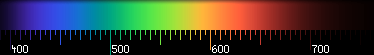
Fig.4. The Visible Colour Spectrum : Wavelengths : The figure shows the colours visible spectrum with a corresponding wavelength in expressed in nanometers (nm.)
Fig.5. Visible Star Colours : The figure shows the star colours that can be seen by the average human eye. Green is not seen in stars, being the an equal mixture yellow and blue. White light is the combination of all colours, and corresponds to an equivalence of all the visible colours perceived by the eye.
For any given wavelength, this therefore consists of one solitary and unique colour. Differences between the painter and the physicist were later brought to some understanding regarding light and the pigments, even though the mechanism of how objects emit certain colours was not.
In 1807, the Englishman and physicist Thomas Young (1773-1829) first stated that in regards the radiation of light, the three primary coloured parts of the spectrum were red-orange, green and blue-violet. Using this, Young usefully explained the concept of so-called additive and subtractive colours. If these colours were added together, then pure white light is created. If pigments of similar colours were subtracted from each other, then this produced pure black. Such observed colour differences were finally fully explained in 1855 by the German Hermann von Helmholtz (1821-1894), whose usefulness of such effects was later exploited in the processes of colour photography and in commercial colour printing. Now similar principles are used in colour monitors used with computers and televisions.
However, so-called chromatic colours, as seen often in paintings and art are all regarded as either achromatic or neutral. Yet, whether white or black are colours is open to honest debate. White light is in reality NOT defined as any colour because it compromises the total sum of all the radiations of the perceived visible spectrum. With light, importantly there are no mixtures of black and white in starlight or sunlight. What we are really describing is instead a kind of montage of many monochromatic hues. This is far different from the worldview of the artistic colours. What the eye visually sees cannot be adequately described in these terms — a remnant fault with the persistence of some early ideas of the nature colour. (It is also the failure of too many untenable colour descriptors.)
There is absolutely no need, therefore, to describe colour in terms of tone, value or purity OR even for “lightness” (degree of greyness). There is only hue and saturation in either starlight or sunlight.
NOTE: “Greyness” is often described in black and white photography as chiaroscuro, meaning the image is the grading of white-black-grey. The same term also describes the general treatment of light and shade in pencil or charcoal drawings and even in some paintings. This Italian word comes two words chiaro — bright and clear and oscuro meaning obscure and dark. In Latin, this is clarus & obscurus, and is an example of an Roman oxymoron!
In colour terms, saturation is the term for absolute purity of colour, but this is actually an abstract hypothesis not usually found in nature. Saturation colours are not of a ray of determined wavelength. They are really mixtures of radiations of differing proportions, being signified by some specific wavelength range that predominates over all the others. Astronomical examples include close double stars. Most are only weakly saturated.
Furthermore, all pigmentary colours appear as slightly grey. Pure colours mixed with white grey or black suffer deterioration of hue, often becoming paler, opaque or more dull (respectively). Colours here appears to be weaker and not brighter. Such colours like these are termed unsaturated
Some Thoughts and Information
on Observed Star Colours
The following compiled information on star colour observations below from various notes and texts that I have collected over the years. Whilst not necessarily definitive in explaining all the observed phenomena, it is useful enough to properly guide or help the visual observer.
It should be importantly stated that all astronomical colour observations has some bad notoriety with the stigma of having a very chequered past. Most is based on several early written works that sadly involves much speculation. Perhaps the most familiar example is the detailed works of Admiral Smyth’s in his ‘Sidereal Chromatics’. Such apparently interesting works are customarily now shown to be either biased, unfounded, or are theoretically totally wrong. A few even are occasionally fraudulent or deliberately misleading. With the modern implementation of more advanced technologies in the latter part of the 19th Century, including spectroscopy, photometry, telescope optics, etc. This soon created the discoveries regarding the nature of light and towards understanding stellar radiance.
Star colours then became from relying not on subjective visual interpretation but instead by instrumental means. From the advent of photography and coloured filters, soon came the means of accurately measuring the colours of many stars in the one field. Here the compared sizes of the stellar images taken in red then in blue light, with the difference in brightness could determine the colour. At once visual colours became of secondary importance, and by the 1920s, the visual art form of observing colours simply died. The first idea to fall was that of rapid stellar evolution, which we know now that nearly all stars essentially stay the same colour through the millennia. (There are variable coloured stars. These are the intrinsic variable pulsating variable stars like the Cepheids, which do regularly change in spectral class (from G-type to K-type) and surface temperatures, because their photospheres are continuously expand and contract throughout the regular periodic cycles. Two colour photography later gave way to photometry, which could measure colour, or colour differences, using different standard coloured filters.)
Perhaps the most important of these became the 1963 Morgan and Johnston UBV standard filter system, with known transmission and absorption characteristics. Measuring colour comes from the apparent difference in magnitude between two filters; typified usually either as the B-V magnitude (Blue minus Visual) or U-B magnitude (Ultra-violet minus Blue.) Other coloured filter systems include the Strömgren ubvβy (or sometimes ubvy) photometric since 1966, which has the advantage avoiding measurement problems like those of interstellar absorption.
Overwhelming, for observers wishing to investigate the subject often now experience typical negative responses, where visually observing star and nebula colours are considered as psuedo-science. The main complaint is the subject is quite unrelated to meaningful conclusions in modern astronomy or astrophysics.
What was once something perceived as something very
important has
now been diminished to mere curiosities by the novice.
There is some serious science involved though…
Last Update : 23rd May 2017
Southern Astronomical Delights © (2014)