PLANETARY NEBULAE : Part 3
COLOUR IN PLANETARY NEBULAE
I N T R O D U C T I O N
One of the most interesting aspects of the brightest
planetary nebulae is in visually observing their small observed disks
with distinct colours. The only other celestial or deep-sky objects
which show significant colours are double stars, which have the
notoriety of having large colour ranges amongst the individual
components by suffer various proximity effects that may influence
each of the component’ colours. I.e.
β Cyg / Beta Cygni (Alberio) or x
Velorum / Δ95. In observations made
at the Astronomical Society of New South Wales’s South Pacific Star Party in 1999
using 25cm LX-200 with fast slewing, it was noticed that you could
quick make comparisons between individual planetaries. The
differences were quite distinct and this made this very easy to
ascertain without much drama.
Planetaries may also have significant colour
variations; as exhibited by three principal emission wavelengths
— Hβ (486.1nm),
OIII (500.7nm and 495.9nm) and Hα at 656.3nm., roughly corresponding to
the colours blue, blue-green and red, respectively. All these three
wavelengths contribute more than 90% of the visible light emitted
from the planetary nebula. As our eyes are inherently poor in their
sensitivity in the red end of the spectrum, most of the Hα light is almost totally invisible to us
at night. Consequently, most nebulous astronomical objects appear to
the naked-eye as either whitish or greenish. Additionally, many
planetary nebulae have most their visible light revealed in
OIII blue-green line, which our eyes are sensitive.
Thus many planetaries appear either bluish or greenish in colour, and
their variations are likely from the combination of the three
wavelength intensities and occasionally some other wavelengths.
Colours of planetaries can be viewed by spectroscopy, and this
remains the only useful scientific method of true evaluation. Such
important information is normally leads to the understanding the
nebula evolution and chemical composition of all planetaries.
The following article suggests one method in making
colour estimations of planetaries through telescopes.
THE NEED FOR COLOUR OBSERVATIONS
At the telescope, most of the perceived colour seen by visual
observers is relatively poor. This is a usual human eye physiological
problem, where the onset of darkness causes this significant loss of
colour vision, whose apparent mechanism lies with the so-called “rod” and “cones” of the
human retina.
Rods essentially measure the intensity of light
in the eye (greyness) and respond very little to colour. As light
intensities do vary so much — ranges from full sunlight to the
near pitch-black of night, the need for such a mechanism is obvious.
As a consequence the “rods” work regardless of the intensity of
light.
Cones are the colour receptors, and as the name
suggest, have their diameters reduce to a small point. With enough
illumination, the wavelengths coming into to eye are separated in to
their component colour, which are sent along the optic nerve of the
brain and interpreted as colour. Details on how the eye does this in
unnecessary to understanding for the night-time observer as much of
the colour is lost to our eyes during the night. In general summary,
although the cones have a threshold to colour sensitivity, and below
particular energies will almost completely ceases to function. As a
consequence, when we look around at our surrounds at night, we
normally only see the range of “greyness.”
When we look through any telescope, we are just exposed to the
illumination of the stars in the field and the astronomical object in
question. Most of the stars appear white or whitish in colour, but in
some circumstances like a very blue or red star, we see some colour.
These colours show very few colour hues, and this is because the
colour component known as saturation is fairly weak. Here
colour saturation simply is described as degree of whiteness in any
perceived colour — so in astronomical objects these produce
fairly pale colours and never intense ones. It is quite unusual
during the night for anyone to see colours more than about 10%
saturation, and although this is fairly arbitrary, experience finds
that more intense colours than this simply cannot be view by the
human eye.
The need for estimating colour in telescopes is likely not very
necessary for the average observer, but for those engaged in writing
astronomical descriptions, such reporting is both interesting and
important to advise and guide other visual or deep-sky observers. For
double stars, such methodologies are already established using scales
like the favoured Hagen Colour Index (HCI). The scale of the HCI is
between the designated colours −3 and +10, describing the whole
range of possible double star colours from blue to white to yellow to
orange to red, and roughly mimics the range seen in astronomical
spectra and between the spectral classes. However, the problem for
double stars using this index, is the inherent weakness is that the
scale does not differentiate between different saturations. Although
this scale is quite arbitrary between observers, as different eyes
will see different colours, leaving a range of possibilities. There
is also possible large numbers of different colours. Moreover, it is
also difficult to ascertain as the stars are point sources, which can
be partly solved by simply de-focussing the stars into larger
disks.
For planetaries the choices of colour are less than double stars
as there are two main colours — blue and green, mixed with a
degree of greyness. If the saturation is less than 10%, then the
range of possible colours is greatly diminished. No real scale exists
for describing colours of planetaries, and with the availability of
larger telescopes like Dobsonians, which reveal more colour, such a
scale would be advantageous. One possible empirical method is the
“Triangular PNe Colour Scale”, as mentioned in this text. Although this
is only one possibility of several methods, it is probably the easy
to use and describe.
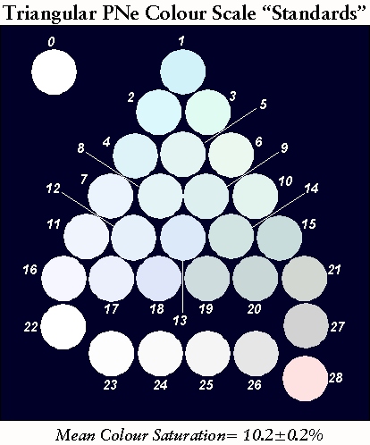
The TRIANGULAR PNe COLOUR SCALE
The following is a method of colour determination for PNe. The
best method would be to print the physical copy and distribute it to
observers, however, the logistic to do this are just too difficult
and frankly expensive!. With the availability of computers and colour
printers, and the software available to do this, it is easier to do
this at home yourself.
Note: I will assume that the observer here has access
to a computer and colour printer, and is aware of how to set the
colour balance of either the printer and/or the computer monitor.
Considering the variations between eyes and minor differences should
not cause too many problems.
I have used the RGB and CMYK colour methods combined
with a standard Grey Scale. These were used to produce the range of
colours and hues. I have based the calculations on 10%
Saturation, and it is unlikely that any observer can see more
stronger colours. The scale is arranged in twenty-one base colours
formed into a triangle. Colour values are based on the amount of
white or grey blended into the colour. Thus, each line in the
triangle being the degree of blue, green and grey.
Calculations to organise the selected colours are not simple, as
the relationships between the colour and saturation are not linear.
In simple terms, the grey scale “Grey” in the
table below are integrated into the selected individual colours, and
looking at the groups across the triangle show the increasing
greyness from left to right.
Each colour value is smoothed by the surrounding
colours within the triangle AND then reduced to the similar “mean”
saturation.
Analysis of this produced the average saturation of
10.2±0.9%, and this final result was made using rough
linear approximations of the R, G and B values combined into one
single value. An average of each different colour in the triangle
producing the final mean saturation (Note: Each of these
relationships are not linear)
C O M M E N T S
 Colour values are only whole numbers, some degree
of rounding was required. This should have little have effect for the
PNe observer. Colour values are only whole numbers, some degree
of rounding was required. This should have little have effect for the
PNe observer.
The
most problematic colour is “Green” No.3, which has a more
“yellow”
than it should be, but the colours found using the colour equations
did not look quite right. Observers should not notice this difference
too much.
The
last line in the Triangle gives the “Colourless”
Value, so no visible colour can be given. Its value is zero.
The
“colours”
Nos. 22 to 27 are degrees of grey and have no added colours.
ALL
DESCRIPTORS really need some discussion and some consensus to
decide their particular “proper” names.
All descriptive colours here are only a Guide for
observers.
GENERAL INFORMATION ABOUT TABLE 1
Table 1 below shows the colours need to reproduce Figure 1.
Adjustments of the Printer and/or Screen need to be determined by the
user. Values for the RGB, CMYK and Grey are given. I have basically
used the RGB scale in these calculations because the values in low
saturation in CMYK are more inaccurate. The “Grey” column
shows degree of “greyness” in the colours, which underlies the
reasonable colours produce in the “triangular”
Colour Scale.
Table 1
The TRIANGULAR PNe COLOUR SCALE (STANDARDS)
Colour Saturation = 10.2±0.2%
| No. |
R |
G |
B |
C |
M |
Y |
K |
GREY |
COLOUR |
OTHER
NAME |
LEVEL |
| 00 |
- |
- |
- |
- |
- |
- |
- |
- |
Colourless |
- |
- |
| 01 |
210 |
242 |
250 |
40 |
08 |
00 |
05 |
233 |
Aqua – Strong Blue |
[OIII] Colour |
1 |
| 02 |
219 |
248 |
252 |
33 |
04 |
00 |
03 |
239 |
Blue |
Hβ Colour |
2 |
| 03 |
224 |
244 |
225 |
08 |
00 |
07 |
04 |
235 |
Green |
- |
2 |
| 04 |
221 |
247 |
247 |
10 |
00 |
00 |
03 |
239 |
Bluish |
- |
3 |
| 05 |
227 |
244 |
243 |
07 |
00 |
00 |
04 |
238 |
Blue Green |
- |
3 |
| 06 |
235 |
248 |
240 |
05 |
00 |
00 |
03 |
243 |
Greenish |
- |
4 |
| 07 |
235 |
244 |
252 |
07 |
03 |
00 |
01 |
242 |
Pale Blue |
- |
4 |
| 08 |
228 |
243 |
246 |
07 |
01 |
00 |
04 |
238 |
Pale Bluish |
- |
4 |
| 09 |
221 |
240 |
239 |
07 |
00 |
00 |
06 |
234 |
Pale Greenish |
- |
4 |
| 10 |
220 |
237 |
235 |
07 |
09 |
01 |
07 |
231 |
Pale Green |
- |
4 |
| 11 |
240 |
245 |
253 |
05 |
03 |
00 |
01 |
244 |
Faint Blue |
- |
5 |
| 12 |
230 |
240 |
251 |
08 |
04 |
00 |
02 |
238 |
Faintly Greenish Blue |
- |
5 |
| 13 |
220 |
233 |
249 |
11 |
06 |
00 |
02 |
230 |
Faintly Blue Green |
- |
5 |
| 14 |
210 |
228 |
225 |
07 |
00 |
01 |
11 |
222 |
Faintly Blueish Green |
- |
5 |
| 15 |
200 |
220 |
220 |
08 |
00 |
00 |
14 |
214 |
Faintly Green |
- |
5 |
| 16 |
245 |
246 |
255 |
04 |
04 |
00 |
00 |
246 |
Bluish-White |
- |
6 |
| 17 |
235 |
240 |
252 |
06 |
04 |
00 |
02 |
239 |
Light Bluish-White |
- |
6 |
| 18 |
223 |
230 |
250 |
11 |
08 |
00 |
02 |
230 |
Light Blue-Green |
Mauve? |
6 |
| 19 |
206 |
220 |
221 |
06 |
00 |
00 |
03 |
215 |
Light Greenish-Grey |
- |
6 |
| 20 |
201 |
215 |
215 |
05 |
00 |
00 |
16 |
210 |
Greenish Grey |
Perse |
6 |
| 21 |
210 |
215 |
210 |
02 |
00 |
02 |
16 |
212 |
Green-Grey |
Perse |
6 |
| 22 |
255 |
255 |
255 |
00 |
00 |
00 |
00 |
255 |
White |
- |
7 |
| 23 |
253 |
253 |
253 |
00 |
00 |
00 |
01 |
253 |
Faint Grey |
- |
7 |
| 24 |
250 |
250 |
250 |
00 |
00 |
00 |
02 |
250 |
Pale Grey |
- |
7 |
| 25 |
245 |
245 |
245 |
00 |
00 |
00 |
04 |
245 |
Greyish |
- |
7 |
| 26 |
230 |
230 |
230 |
00 |
00 |
00 |
10 |
230 |
Moderately Grey |
- |
7 |
| 27 |
210 |
210 |
210 |
00 |
00 |
00 |
18 |
210 |
Grey |
- |
7 |
| 28 |
253 |
226 |
225 |
00 |
27 |
28 |
18 |
2 |
Reddish |
10% Hα |
7 |
COLOUR COMPARISON CHARTS
ENDNOTES
This text is a fairly rough draft and I would like
to get some feedback on the soundness and usefulness of the method
before fully explaining the methodology.
It is possible to expand this
“Triangle Scale”, for saturations at 20%, leaving stronger
colours if anyone things the degree of blue or green is not
sufficient.
The scale can be expanded for other colours than
blue and green. Another alternative would be a second triangle, below
the grey scale on the last line, and this would display the colours
of red and yellow. As all PNe are not this colour it is likely
unnecessary, however, it would be good for completeness, and perhaps
useful for double star observations.
Last Update : 27th November 2012
Southern Astronomical Delights ©
(2012)
For any problems with this Website or Document please e-mail
me.
|