STAR COLOURS : 1
“The form is the body of the
colour, ’
The colour is the soul of the
form.”
Sigfrid A. Forsius (1611)
I N T R O D U C T I O N
General problems observing star colours is an interesting
subject. As an astronomical subject, the attempts to explain the
true cause of star colours originates dates back to the early to
mid-19th Century. Much was thought and written by European
astronomical circles, and this inspired the main visual
observers of the times to investigate both single and double
stars. The latter proved more unusual, as having two star close
together allowed direct colour comparisons, which visually
seemed to be far more colour enhanced. Perhaps, they had
concluded, knowledge of these colours might lead to better
understanding of the nature of stars — an aspect that
continues now and likely into the future.
Beginning in the early 1800s, existed various conventional
observations with an odd collection of accepted scientific or
possible likely theories about the nature of star colours. Many
then were popularly adopted by many visual observers, which
continued with great interest and real furore into the early
20th Century. Without having the important advantages of modern
astronomical spectroscopy or colour filter photometry, little
was known about the evolution of stars, their intrinsic
luminosities, nor even knowing the critical relationships
between luminosity, stellar surface temperatures and all the
observed stellar colours. There was also no broad-based
knowledge of the true nature of radiation or the true power
source that makes all stars shine so brightly nor of their
ages.
Yet, by using some very careful and astute observations, some
everyday useful information was obtained. They soon quickly
learnt about general star colours by visual means were greatly
lacking — mainly by the simple failure of human eye to
function sufficiently well to see agreeable star colours in the
nighttime. Compared to modern telescopes of today, many of them
were of poor to very poor optical quality, often adopting
difficult and cumbersome telescope mounts. This was made more
apparent with the need for larger reflecting telescopes, whose
basic available technology did included inadequately reflective
surfaces from their metal speculum mirrors or significant light
loss through optical glass in their often more crudely made
optics or unsophisticated narrow-field uncoated eyepieces. These
real observational restrictions all combined to make star
colours observations as very subjective, error-prone and
often quite flawed. In the end, from even their best-adopted
experimentation and observational methods, they failed to reach
any consensus or repeatability in their visual observations.
Until they had more objective means of producing
empirical based evidence, their aspirations to understand the
nature of stars from visual star colours remained simply
unobtainable. The final death knell of naked-eye estimations of
star colours was the discovery of astronomical spectroscopy,
followed by using colour filter photometry, and then finding the
basic scientific explanation of the electromagnetic nature of
light and in how our eyes see colours. Today, much of this early
work is mostly either irrelevant or unimportant knowledge
without any positive contribution to observational astronomy or
astrophysics. Sadly, even today, there still continue to be many
poor and inaccurate views about star colours. Some of these
antiquated notions and ideas have now continued to persist
beyond a whole century.
COLOURS : DESCRIPTORS & ILLUSION
Another truly dreadful aspect of star colours in astronomy,
which continues even now, has been the adoption of using far too
many grandiose colour names. In some cases, this has literally
expanding possibly many thousands of different colour names,
technically known as colour descriptors or just
descriptors.
One has only to look in your local paint shop and their
colour charts to see the range of possibilities for their names.
In truth, you can significantly increase the subtleties by
mixing two or more coloured paints in different proportions to
make new colours, and that does not include adding touches of
black or white paint to make the paint darker or lighter.
In the everyday world, colour has vibrancy and shows a
variety of optical phenomenon. Each day we see uncountable
differences with colours, which we have learnt to take for
granted — just as some normal everyday experience of life.
No one seriously could be bothered to name them all.
Worst still, my own eyes likely do not exactly see the same
viewed colour as you or even another person. It is like some
lonely personal experience. Hence, my own colour descriptor may
not exactly match yours. Like children, we combat this simple
problem by describing the everyday life basic colour names like
red, blue, yellow, green, orange, etc. If I see something that
is blue, for example, you quickly know what my word means even
though it might be different between you and me. Were the colour
important, then I might use other associated words like
dull, pale, light, strong,
bright, etc., therefore extending the range to perhaps
several hundred colour name variations.
Everyday experiences under daylight or indoor lighting finds
even more diversity with colours. By changing the background
lighting on any painted coloured surface; say from light sources
that daylight, incandescent, halogen or fluorescent, and the
perceived colour are significantly again
different.† Technically, this is related to the
source colour temperature. For example, colours also change when
viewing them on your computer screen display, being made by
calibrating or setting the average daylight colour temperature
to 6500K (actually 6503.6K) or so-called standard illuminant
D65 define by 0the ‘Commission Internationale de l’éclairage’ / ‘International Commission on
Illumination’ (CIE) via the
available computer software preferences. Here temperature
corresponds to the appearance of natural daylight by changing
the display’s white point
of the computer screen. Changing this temperature make higher
values bluer and lesser ones redder. So importantly, colours
appear differently when you compare them to subdued or bright
surroundings.
† Note: You can
test this yourself using the website of paint manufacturer,
Dulux, and using there Java software program called My Colour
4 and just follow the prompts. Here you can download an
exampled image or add one of your own.
More controversially, colours may also affect your general
mood, where reds and oranges are often heart warming, yellows
are perceived as more happy and cheerful, while greens and blues
can make you peaceful, cool or even calming. Dark colours often
are more sombre in mood, while bright colours can be cheerful
and pleasant. Contrasting colours can give dramatic effects like
modifying the sense of a space, or highlighting some internal or
external feature. Changing the background illuminating light
source may make these effects even more dramatic.
If colours are so greatly experienced in
all its diversity, then
why cannot we just simply apply
these same rules to stars?
Well yes, you could, but it would not be very practical. The
problem is simple to realise, as if you go outside in the dark
at night, nearly all colour disappears. We see the wide gambit
of millions of colours in the bright day, but at night, we
mostly only see black, greys and white. Logically this is
something to do with eye sensitivity under hugely varied
illuminations. Our conclusion reaches to the idea that specific
colours are not so obvious in our surrounds or the many faint
stars in the nighttime sky. To argue otherwise is simply against
commonsense. As an open question;
How real is perceived star colour at night?
Do our eyes see colour in precise exactitude,
or is it just some kind of grand illusion?
This broad-based article attempts to answer this question,
and lets you make your own general conclusions.
Reporting Nighttime Star Colours
It still remains a little hard to comprehend how such commonly
expressed border-line or subjective colours can exist in stars. Ones
like gold, crimson, lilac, indigo, grey or ashy can not be readily
or usefully employed to describe star colours for most practical
visual observers.
Some, perhaps, do often just innocently exaggerate the colours
that they see. Probably they are only wanting to present these more
exotic colours to make them seem either more original or accepted
within the amateur astronomical community. Few may be nonetheless
viewed as faux pas. Yet many do still continue to appear in
articles throughout the popular magazines or in the observational
astronomical press.
In my own humble opinion, several of them can only be described
as new-age charlatans. Several wilfully claim in having
either some kind of personal superior colour vision or special
knowledge based on the quite whimsical notion of the observer being
the better sex or having the better colour perception. I have even
seen published star colours seriously presented as apricot, peach,
amber, silver-white, lemon-brown, beige, khaki, or even turquoise!
These were even mixed with so-called reflectance terms, like
gloss, translucency or in illogical words like
shadowy — whose the latter meaning is very uncertain
here.
Why describe such insubstantial or unreal colours?
All usefully observed star colours are far more straight
forward!
In the end, such meaningless descriptions are just pure and utter
nonsense because they are pseudo-visual colours, which
verbally have quite arbitrary meanings — useless meanings that
convey nothing at all to another person and are only useful to the
individual that gave them! Worst with these kinds of observers is
that the colours they are describing are physiologically
impossible to see at night.
My reasoning of those persons stating these views is that they
are presenting descriptive colours of so-called highly rich and
saturated colours — something we will discuss and very
much argue against in depth in this article. Furthermore, these
importantly are also odd palette-like mixtures with the additional
tones of black, greys or white — something that is not seen in
the continuous spectra being observed with stars.
I really do think these types of amateur
charlatans as observers must be immediately discredited,
if only for the reason that they give very poor representations
of the many good, sensible and dedicated amateur astronomers
throughout the world.
Perhaps, as some earlier readers of this text have also openly
said to me, That I am perhaps being a bit too critical of the
situation. My sole aim and open wish here to highlight that using
more specific or simpler colours schemes are far more sensible
than in trying to match precisely what subtle shade of colouration
one particular star or double star system appears to be.
Difficulties in Seeing Star Colours at Night
With star colours, much of the biological and chemical mechanism
regarding colour vision unfortunately does not work very well at low
illuminations. This is a major limitation for visual observers to
overcome. These serious flaws really lie with the specialised cells
known as cones located along the retina of the eye, being the
main sensor that gains nearly all of the light needed for
interpreting colour. It seems the human eye for all its true
biological wonder was just never designed for good night vision.
This is bad news for the amateur astronomer who is trying to
perceive fainter objects and to see colour or spectral-based
phenomena. Worst, there is no doubt that the age of the observer is
likely another contributing cause for the eventual loss of the
ability to interpret the spectral range. More unfortunate is that
the younger the individual, the less able they can describe the
visual colours they see just through lack of experience! Yet the
real experts in recent times about eye colour perception have been
made by several French visual observers, with several interesting
papers in the last twenty to thirty years or so. For example, I have
presented in Southern Astronomical Delights the translated
version by Paul Biaze’s “Les
Couleurs des Étoiles”
or [The Colours of Double Stars] written in the late-1950s
which is quite analytical and very innovative. A further excellent
summary of this subject about star colour appears in David
Malin’s Colours of the
Galaxies (1996), which is recommended reading for all amateur
observers.
Overall, the study of colour perception for stars is still
incomplete. This general article is about the cause of colours that
we see in telescopes and why they are so hard to observe. It was
also written to counteract the seeming avalanche of several new
double star observers who have been claiming that they have some
superior vision or better colour perception.
Please, if you are one of those observers that
believe what I am saying here is completely wrong, then I do suggest
you reading the next four paragraphs very carefully before
reading the rest of the text before you condemning me for
evermore.
NATURE of EYESIGHT and COLOUR VISION
At the telescope, any observed colour is more
often than not, fairly poor. This physiological problem is
indisputable, as the weakness of the sensitivity of our human
eyes at night or in darkness is primarily the cause the loss of
colour vision. The very important mechanism of our vision lies
with the so-called specialised cells structures known as
rods and cones that are physically attached across
the surface of the human retina at the back of the
eyeball socket. Each eye contains on average 137 million
light-sensitive cells having the mean density of 650 per square
millimetre. These are approximately in the ratio as 617 black
and white rods with only of these 33 (5½%) being the
colour cones. About 7 million of the total are cone cells, whose
average density are divided into thirds — equally being
divided as either red, blue or green-sensitive.
Rods are designed to measure the
intensity of light in the eye (greyness) and respond very little
to colour. As light intensities vary so much, ranging from full
sunlight to the near pitch-blackness of night, the need for such
a mechanism is obvious. It also affords the detection of
contrast. An analogy of this is similar to the controls of black
and white televisions. The “rods”
will work regardless of the intensity of light.
Cones are the colour receptors, and
as their names suggest, are in the shape of a cone whose
diameters reduce almost to points. For this reason they are poor
light receptors, but with enough illumination, the wavelengths
coming into to eye can be separated in to their component
colours. The signals are then sent along the optic nerve of the
brain and interpreted as colour. The details on how our eyes do
this is probably unnecessary to describe for the general reader.
Needless to say, the understanding of the cause is chemically
very complex, relying on many reactions and processes.
There is no known significant numerical differences of
rods or cones between human males and females.
During nighttime, visual observers find most star and deep-sky
colours are mostly lost to our eyes. The simple reason is that cones
have known thresholds for colour sensitivity, and below particular
light energies (flux) they almost all completely cease to function.
Consequently, when we look at our general surrounds during the
night, we see only a slight range of “greyness.”
Looking through any telescope, we are immediately exposed to the
wide field illumination of the field stars and the astronomical
object(s) in question. Most stars just appear white in colour, but
in some circumstances, like the very blue or very red stars, we do
begin to see some distinct colour. Also the fainter the star or
object the less colour we see are able to discern. Hence, colour is
also magnitude dependant. (Further discussed in Star Colours : 2)
Star colours that we see are quite different from what we mostly
see during our everyday living because at night we perceive very few
hues. This is due to the colour component known as saturation
that can be described as the degree of whiteness in any
perceived colour. Importantly, saturation is fairly weak in all
stars. For many astronomical objects these will produce only pale or
washed-out colours and never intense ones. The only true exception
is probably the deep-red carbon stars which also visually appear to
have a little blue or yellow light contributing to their general
spectra and appearance. Such stars, however, are very unusual and
rare.
Seeing star colours at night is unusual because
we can see no more than about 10% Saturation.
Experience finds that the more intense colours at night simply
cannot be observed. The degree of saturation also only slightly
varies between different individuals, and gets generally worst with
age. Importantly it is also visually dependant on the background
colour it is seen against.
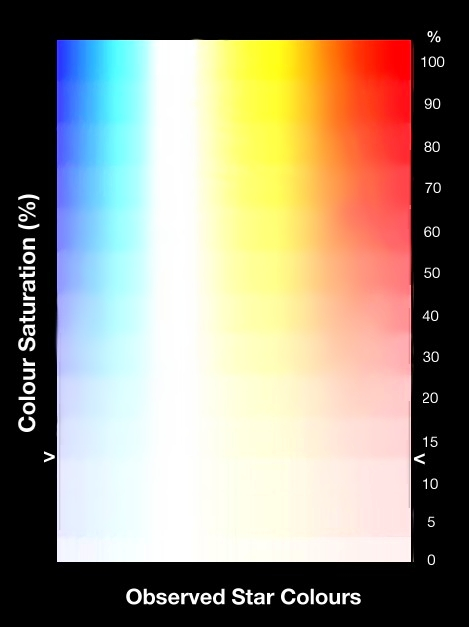
Figure 1a. Variation of Colour Saturation
Shown here are the colours of red, orange, yellow,
light blue and deep blue. Colour saturations above 10% are very
rarely ever seen in stars or bright nebulae. 0% colour saturation is
the pure white. All 100% saturation colours are often termed as
pure colours.
Figure 1b. Variation of Star Colour Saturation
This shows an alternative view of colour
saturation. The horizontal axis shows the variation in
star colour from blue, through yellow and orange, ending in red.
The vertical axis gives the percentage (%) colour
saturations. As previously stated in the text, colour
saturations at night are very rarely above c.10% seen in stars
or nebulae. This is designated by the “ > < ” placed in the above graphic.
Important Note: How this figure appears to
you will vary significantly depending on monitor quality and its
adjusted calibration. It should NOT be used when compared to
visual observations, as it is solely aimed just to highlight the
importance saturation in stars at night.)
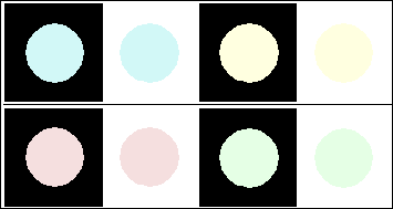
Figure 2. Effects of the Background on Visual Perceived
Colour
This shows visual effects of 20% saturated colours
as seen against either a black or white background. Each highlighted
colour is identical, but visually our eyes see that those against
the lighter backgrounds make the inside circle colour seem to be s
lightly darker. This is visually caused by colour contrast
interpreted by the eye, being comparable to looking at stars at
night. For example, seeing stars during the hours of darkness when
compared to seeing them against the background sky under either
twilight or daylight. Similarly, double stars with quite different
surface temperatures finds similar visual effects, which enhances
apparent visual colour differences. Amateur observers should also
note that increased magnification using different eyepieces makes a
slightly darker background field and this leads to slightly changing
the observed star colour.
Any real need for estimating the observed colour in
telescopes is likely not very important for most visual observers.
However, this is not absolutely true for those engaged in writing
astronomical descriptions or in promoting astronomy. Such colour
reports are both interesting and important to advise, whose
knowledge may guide other double star or deep-sky observers towards
some more attractive targets when observing.
How Much Reality is There In
Seeing Star Colours at Night?
Based on scientific optical experiments by visual physiologist
Denis Baylor in 1978, it is now possible to conclusively dismiss
misconceived notions of colour discrimination by telescopic
observation. (See References) These
original detailed experiments were conducted at the Department of
Neurobiology at Stanford University whose main aims were
specifically to measured the eye’s
main photon response in darkness. Baylor attached a photoelectric
photometer to individual rod and cone cells in human retinas, and
then measured photoelectrically the response of the photons of
various monochromatic colours. After analysing the results, his main
conclusion found that at very low illumination, all cone cells
switch off and cease their entire electrical function. This for the
first time quantitatively explains the reason for loss of nighttime
colour vision. Baylor further says about his general results;
“This state of
affairs makes it impossible for one cell, either a rod or cone, to
signal separately wavelength and intensity. Consider a single rod
upon which falls 100 photons of 550nm. wavelength. These photons
will be absorbed with the probability of say 10%, so that a total of
ten absorptions will occur. Ten absorptions would also occur if 1000
photons were incident at 600nm. A particular wavelength therefore
has the mean probability of absorption of only 10%. Since the cell
reports only the number of photons absorbed, the signals generated
by the two coloured lights are identical, even though their
wavelengths are different. Hence no colour (wavelength) information
is available. This explains why in starlight, where only the rods
contribute to vision, we have no colour sensation.”
From this we can only conclude that as the rods receive the dim
light, then our brains then try to interpret the actual colours it
thinks it is seeing. Furthermore, as the star colours are never
saturated, so what we generally see is only slight variations in
hues. Hence, a narrow range of greys and only very bright saturated
colours will be perceived as dull slightly coloured greys.
You can attempt such an experiment yourself. Look at a number of
highly coloured book covers in the home under normal light
illumination in the home. Turn off the lights, letting you eyes
adapt for a moment, then look at the same coloured objects. If
possible, turn on a more distant indirect light, and again observe
the colours you see. In the end, you can see the reds, yellows and
blues, but it becomes much harder to distinguish intermediate
colours as readily under normally bright illumination.
STAR COLOUR SCHEMES
One of the first crude scientific star colour schemes was made by
the variable star astronomer and editor of the Astronomical
Journal, Seth C. Chandler (1846-1913) in 1901 (Chandler
Scale — CI) using only seven basic colours to divide
stars into simple colour groups. However, this idea was soon openly
criticised, because it was so limited and unnecessary. Even the
southern visual double star observer R.T.A. Innes (1861-1933)
was one of the greatest critics of Chandler, stating that he placed
little credence in knowing star colours as they could be equally
obtained photographically using two colour sensitive films or by
instrumentally by filter photometry. I could not find any related
information in whether John Hagen did accessed the work of Chandler
or Innes, but personally I do see much usefulness with the Chandler
Scheme for most visual observers — mainly because it can
easily distinguish these colours through the telescope. I’d also assume this would be exactly the
same for the majority of people!
Innes seems to have reflected on this in his “Southern Reference Catalogue of Double
Stars” (1899), but initially
mostly ignored the colours of double stars. Those that he did
mention colour were mainly the brightest pairs having clearly
significant colour contrasts. However, he seems to have changed his
mind between 1901 and 1903. In the updated and additional pairs of
this catalogue in 1903 (“Micrometrical measurements of Double
Stars 1849-1868 and 1899-1903”;
Annals of the Royal Observatory, Cape of Good Hope Vol. II.
Part IV.), Innes adopted a colour abbreviation system usefully
describing double stars. This, I think, seems to have eventually
became adopted into others like the Hagen Colour System. (See
Below.) To reflect these changes, I have quoted his exact words,
which Innes says in the “Preface” on star colours on pages. ix.-x.;
“…the fifth
column gives the colours observed, wherein 0 will signify a white
star, 10 an intense red star, and the intermediate numbers various
stages from white to red, as follows” :—
| 0 White |
| |
6 Orange Red |
| 1 Yellowish |
| |
7 Reddish |
| 2 Yellow |
| |
8 Red |
| 3 Deep Yellow |
| |
9 Very Red |
| 4 Orange Yellow |
| |
10 Deepest Red |
| 5 Orange |
| |
|
|
further |
|
|
|
|
| b |
signified |
Bluish |
| B |
′ |
blue. |
| p or pur. |
′ |
purplish. |
| y |
′ |
yellowish |
| Y |
′ |
yellow |
It seems useless to go for further subdivisions or
for fancy names of colour which can only convey distinct meanings to
their actual author.
The close approach of Mars and γ Virginis, as seen with the naked eye in
March 1903, affords a comparison. Mars would be 4 or 5 in the above
scale, γ Virginis was decidedly
bluish (b); this was due to contrast, as γ Virginis is a yellowish star.
Although the data as to colours are very
incomplete (a) because if the companion is very faint it is
impossible to estimate its colour, (b) because of a remarkable
contrast in colour is unlikely to miss being recorded, the following
rough analysis of the observations of colours of double stars is of
some interest.
|
Average
Proportion
per cent. |
Range of
Difference in
Magnitude. |
Difference of
Magnitude |
| Both stars white to yellowish, but of the same
tint |
29 |
0.4 |
0.0 to 1.7 |
| Both stars of the same tint but decidedly
yellow or |
19 |
0.4 |
0.0 to 1.6 |
| Both stars of the same tint |
48 |
0.4 |
0.0 to 1.7 |
Chief star yellow or yellowish, but the
companion
decidedly a deep yellow |
4 |
2.5 |
1.7 to 4.1 |
| Chief star yellowish, companion bluish, |
16 |
2.4 |
1.0 to 4.02 |
| Chief star full yellow, companion bluish |
23 |
2.2 |
0.9 to 4.0 |
| Chief star yellow or yellowish, companion
blue |
8 |
2.9 |
0.7 to 5.7 |
| Chief star bluish, companion yellow or
yellowish |
1 |
1.0 |
0.2 to 1.7 |
|
____
100 |
|
|
The general close accordance of the colour
estimates given in the catalogue shows that such observations are
not without value.”
This was soon superseded in 1924, when Rev. John G. Hagen
(1847-1930) produced his new more logical colour scale. Hagen had
specialised in eclipsing binaries, and also produced the famous Star
Atlas called Atlas Stellarum Variabilium between 1899 and
1908. In time his name became synonymous with his colour scale that
proved to be the more useful version of the previous and poorly
adopted Chandler Index, simply known as the Hagen Colour Index
(HCI), the scheme just labelled all star colours; ranging
between the values of -3 for Blue and +10 for
Red with neutral White corresponding to the B-V value
of 0.0. This particular colour scheme has remained the popular
nomenclature and is now often adopted by amateurs who do variable
star observations or make micrometrical measurements of pairs.
Colours in this scheme were; Blue, Bluish, White, Yellowish,
Yellow, Orange and Red. Hagen simply just adds additional
colour values for these seven basic colour elements.
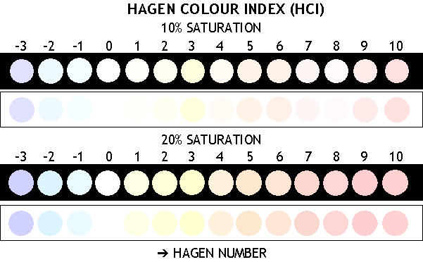
The HAGAN COLOUR INDEX (HCI)
Hagen
No. |
Colour
(English) |
Colour
(French) |
| -3 | Pure Blue |
Bleu pur (Bleu) |
| -2 | Pale Blue (Bluish) |
Bleu-clair (Bleuâtre) |
| -1 | Bluish white |
Bleuâtre-blanc |
| 0 | Pure White (White) |
Blanc pur (Blanc) |
| 1 | Yellowish white |
Blanc jaunâtre |
| 2 | Pale Yellow (Yellowish) |
Jaune pâle (Jaunâtre) |
| 3 | Pure Yellow |
Jaune pur (Jaune) |
| 4 | Orange Yellow |
Orange-jaune (Orangâtre) |
| 5 | Yellow Orange (Orangish) |
Jaune-orange |
| 6 | Pure Orange (Orange) |
orange pur (Orange) |
| 7 | Reddish Orange |
Orange rougeâtre |
| 8 | Orangey Red |
Rouge d’orangey |
| 9 | Red Orange (Reddish) |
Rouge-orange (Rougeâtre) |
| 10 | Pure Red |
Rouge pur (Rouge) |
Most visual observers tended to use the Hagen Colour Index
(HCI) which relates closely to stellar surface temperatures
and the B−V Colour Index. No one truly adapted this as an
“analytical” method, but as an extra means of
determining the “correct” position angle of both the stars,
especially when the magnitudes are nearly equal.
Note: The original observer designations in
double stars overrides the estimation of the brightest against the
faintest star. This means the designation of A and B
components are pre-set by the discoverer. The HCI probably has some
analytical basis, however, the linearity with visual divisions in
quite poor. I.e. The non-linear values, of say, white to yellowish
stars are different, from say, blue to bluish or red to reddish
stars.
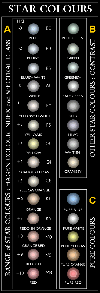
Figure 3. The Hagen Colour Index (HCI) — 10% and 20%
Saturation
This shows the Hagen Colour Index Scale with
both 10% Saturation, the likely maximum visible colour, and 20%
Saturation. I have contrasted the colours against both black or
white backgrounds so the visibility of the colours and the contrast
effects can be seen. The Figure above clearly shows these
differences. All observed colours will be also slightly different
when they are pinpoints, and the colour presented here are closer to
the defocussed star images that can be seen in the telescope.
Observers should note that calculated colours are approximately 10%
and then I have had to make several small
adjustments so that the colours look a bit more consistent. However,
this changes are quite likely inconsequential for many visual
observers. Most stars will be fainter than the colours presented
here and nearly all of the fainter stars will have almost
insignificant saturations.
Anyone using the colours for observational
comparison should ONLY use the 10% SATURATION SCALE.
It was M. Minnaert who first discussed star colours in more
modern terms. If we assume that star colours are based on the black
body properties of objects, as seen in some ultra-hot furnace. A
famous simple experiment of this is to continuously heat a small
piece of tungsten wire in electric light filaments. Here the colours
distinctly change as the temperature rises; from red-hot,
yellow-hot, white-hot then blue-hot. This also similarly follows the
observed spectral sequence of stars and the B−V colour
index. He then usefully adopted the series of eight separate
colour groups as distinguish by eye. Then he did a simply blind
experiment by comparing his colour estimates against the B−V
colour index, which proved to have an observed high correlation.
From this, he then first achieved the feat of being able to
distinguish the spectral class letter of the object. Minnaert gained
much kudos for this achievement in his day!
Minnaert also investigated the colour of the white and yellow
stars, finding that they could distinguish the yellow ones into
white-yellow, light yellow, pure yellow and deep yellow. (The reason
for this, I think, is that the eye is more sensitive to seeing this
part of the spectrum, especially when compared with the red, and the
far blue.) Interestingly, his experiments validates the problems of
colour saturation. His book concludes that only eight major or
primary star colours each corresponding to the mid-spectral
classes of O, B, A, F, G, K, M, S.
Figure 4. Colours of the Spectral Classification — 10%
Saturation
Figure 4 shows the colours of the Spectral
Classification at 10% Saturation. The colours can be estimated in
the telescope with care, but observers should note that these are
the maximum colours and most of the stars have much lower saturated
colours. I have contrasted the colours against both black or white
backgrounds so the visibility of the colours. The colours here are
suitable for using in drawings of star charts where the spectral
class is required.
Again, anyone using the colours for observational
comparison should ONLY use this 10% SATURATION
SCALE.
According to David Malin (AAO), it was the astronomer Leslie
Morrison from the Royal Greenwich Observatory who attempted visual
observation of stars through the transit telescope, and doing a
blind test, could guess the Spectral Class of the star in question!
Each class could be seen and ascertained with the eye, with each
have only three or four shades of certain colours, with the solitary
“non-colour” of white. There are fourteen “valid colours” in this second system, being in order
of;
The MINNAERT COLOUR SCHEME
|
BLUES
|
WHITES
|
YELLOWS
|
ORANGES
|
REDS
|
Deep blue
Light blue
Blue-white
|
White
|
White-yellow
Light yellow
Pure yellow
Deep yellow
|
Yellow-orange
Light orange
Deep orange
Red-orange
|
Orange-red
Light red
Deep red
|
DESCRIPTORS FOR DOUBLE STAR COLOURS
For double star observers such methodologies have been already
established using scales like the Hagen Colour Index (HCI). This
scale has values between -3 and +10, describing the possible range
of fourteen double star colours — from blue to white to yellow
to orange to red. This roughly mimics the range seen in astronomical
spectra, in stellar surface temperatures and spectral classes.
However, the problems for double stars observers is that using
this particular index, finds the fundamental inherent weakness is a
scale is that it does not differentiate between the different
colour saturations. Furthermore it takes no account of
the stellar magnitude. Although this scale is quite arbitrary
between observers, different eyes will certainly see different
colours. Unfortunately, the HCI system leaves too large a range of
observable possibilities for the many different colours. Moreover,
detecting colour is also very observationally troublesome to see as
the stars more often than not appear simply as point sources. Often
by just simply defocussing the star into small plate-like disks can
be applied to partially exacerbate this problem.
Figure 5. ⇒ (On the Right-hand Side)
gives
the approximate look of the vast majority of star colours in the
telescope. This is based on 10% Colour Saturation given earlier
in the text.
A. The White Box on the left-hand side of the Figure
shows the Hagen Colour Index Number, the approximate observed
apparent colour and the Spectral Class it pertains towards.
B. The White Box on the right-hand side (at the top)
is the reported colours sometimes seen by observers. I have
labelled this as due to Contrast Effects because more
often than not they are only seen in visual double stars.
C. The White Box on the right-hand side (at the
bottom) gives the pure monochromatic colours as they would be
seen in a telescope. These of course do not exist in Nature and
are given as comparison.
When reading some older books, texts and catalogues, you will
sometimes find the use of the following abbreviations. (See Table
below.)
These main colour can also have the following additions: Colour
that are less bright than normal are prefixed p pale
— or if brighter in colour are r rich or d deep.
I.e. pale blue, rich yellow, or deep red, etc. Colour tendencies
towards any colour are sh but is very rarely used.
| Abb. |
Colour |
| W | White |
| B | Blue |
| Y | Yellow |
| O | Orange |
| R | Red |
| P | Purple |
| G | Green |
| C | Grey |
| L | Lilac |
| A | Gold |
| S | Ashy |
Unconvincing colours, for example, a suspect yellow star would be
Ysh (Yellowish) or Bsh (Bluish).
A further usefulness for this colour scheme is that the observer
can quickly write down these abbreviations in his or her observation
notes. Although the use of colour is likely not important, but it is
an additional descriptor when checking the pair at some later date
to differentiate equally bright components or in reducing
observations.
Later use of the abbreviations now tend tofavour the Hagen Colour
Index (HCI), which relates closely to stellar surface temperatures.
Using this index, visual observers should report as e.g. “−2 / 3”, being its pale blue primary and pure
yellow secondary. Other additional colours were added later I.e.
−0.5 for grey and −0.25 for green.
REPORTING STAR COLOURS
GENERAL RULES
 If the colour is a definite colour, report it
as eg.“White” or “Blue”
etc. If the colour is a definite colour, report it
as eg.“White” or “Blue”
etc.
If the colour seems a definite tint, report it as eg. “Yellowish” or “Bluish” etc.
If it seems either like a combination or range of colours report
it as “Bluish” or “Bluish-White” etc.
If the colour can not be described, record it as “Unusual” or “Colourless”
If the primary’s colour is seen
but not the secondary, record it as “Blue / − ” etc.
For a continuance of this page: See Star
Colours 2. (Next)
Last Update : 23rd May 2017
Southern Astronomical Delights ©
(2017)
For any problems with this Website or Document please e-mail
me.
|